


Timeline:
May - June 2023
May - June 2023
Scope of Work:
Visual Branding, Illustrations, Graphic Design, Guidelines
Visual Branding, Illustrations, Graphic Design, Guidelines
Collaborators:
Tunbosun Tobiloba, Motion
Tunbosun Tobiloba, Motion
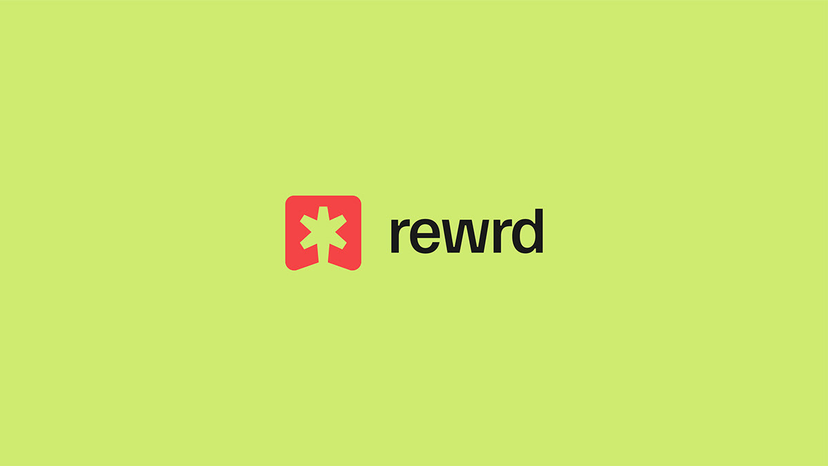
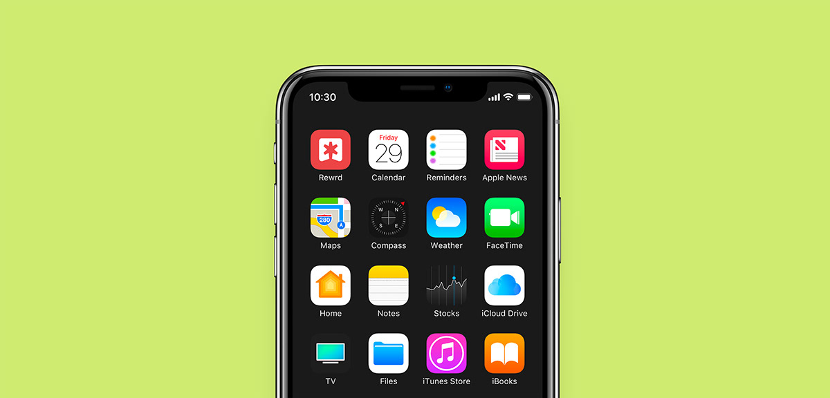
Rewrd
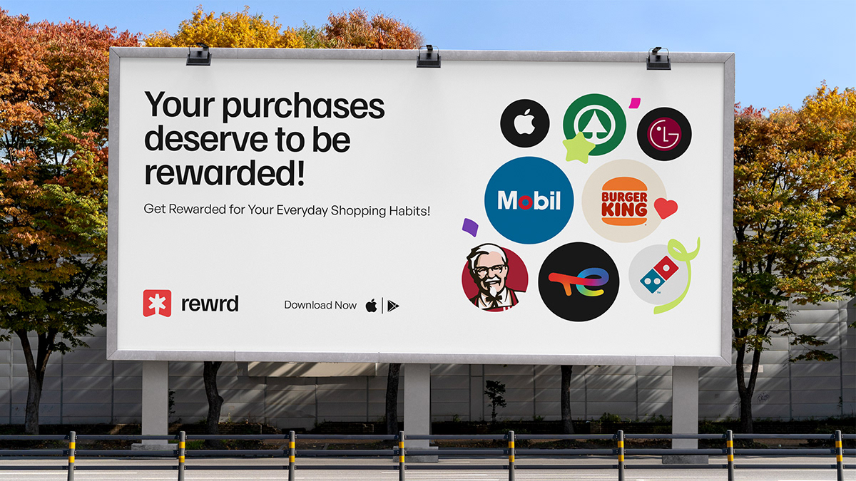
Rewrd is a customer loyalty, reward and cashback platform that values people everyday purchases. Rewrd believes in rewarding users for purchasing the things they love and would typically buy. With a simple upload of purchase receipt, they provide enticing rewards for users while supporting their favorite stores and restaurants.
Incentivizing Nigerians to shop at their favourite stores or restaurants and in turn getting effective and real time market insight that helps brands to understand user behavioural and purchase patterns.
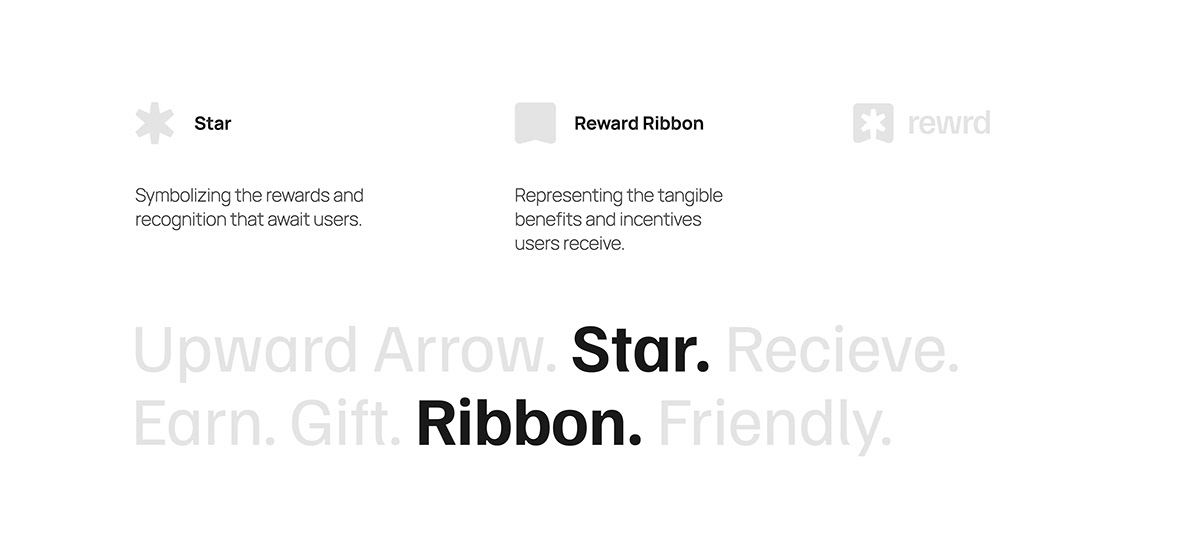
Logo Rationale:
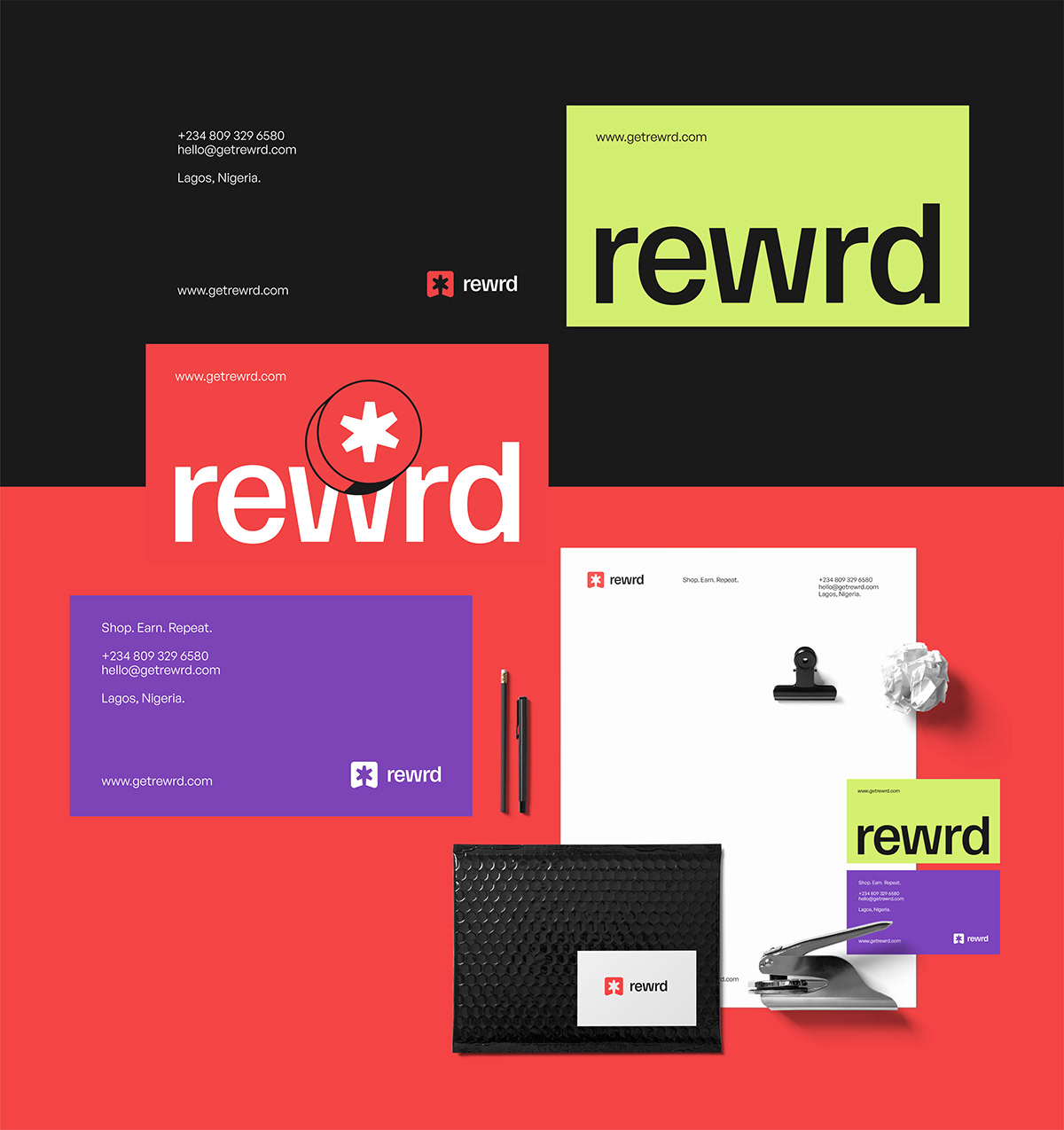
Given Rewrd's role as a customer loyalty and reward platform, extensive research was conducted to identify suitable visual elements. This exploration culminated in the integration of the star and ribbon symbols. This logo represents Rewrd's core value proposition, portraying the platform as an avenue where users can actively engage in the pursuit of exclusive and exhilarating rewards and benefits.


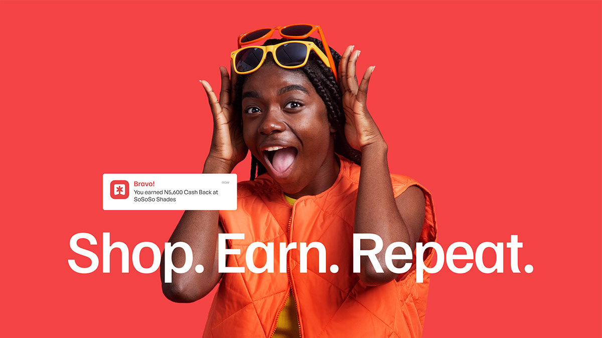
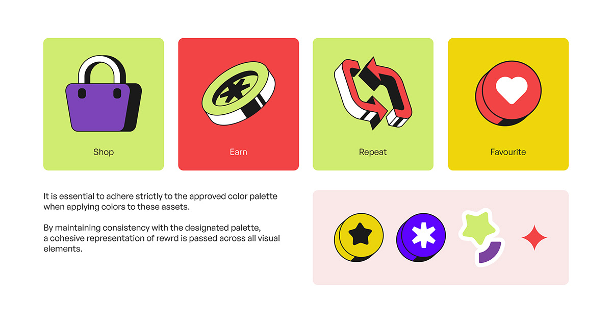
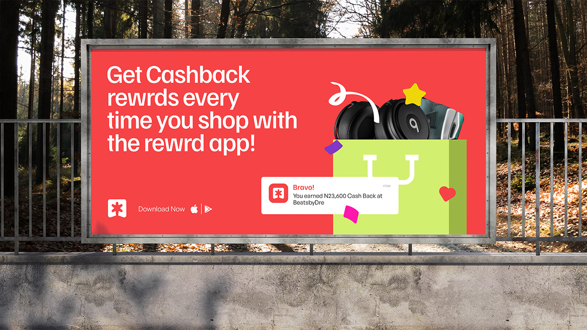
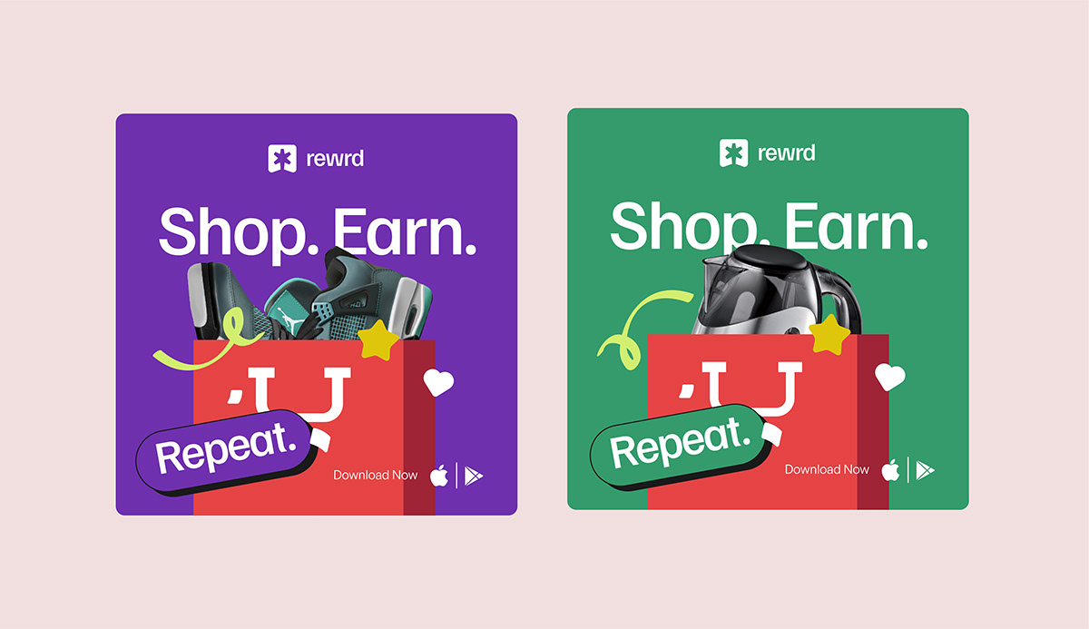
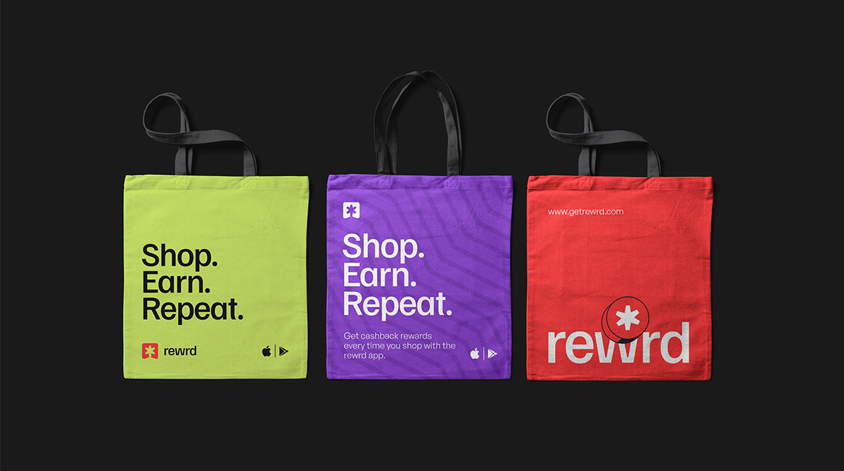
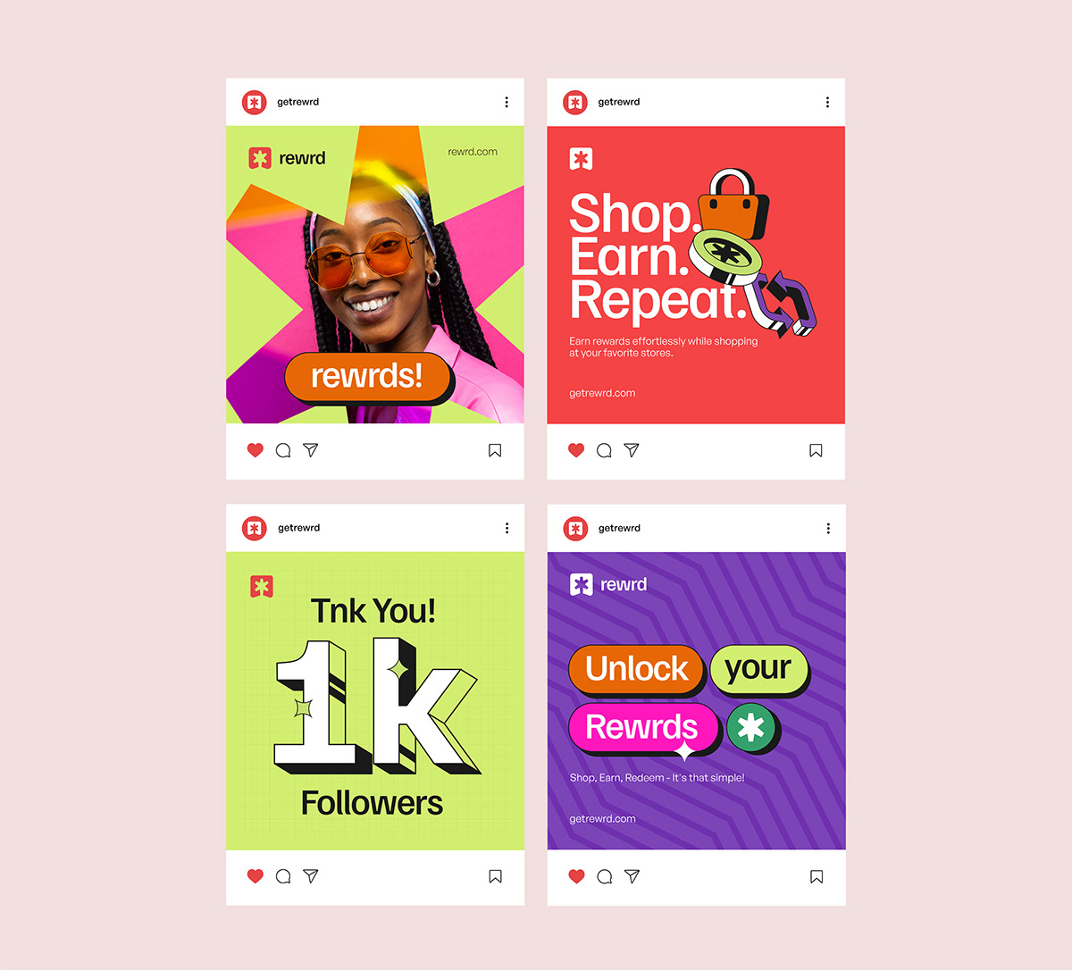
Rewrd's Mantra: Shop. Earn. Repeat.
Rewrd's mantra embodies the essence of a customer loyalty, reward and cashback platform. With every purchase, people can shop for the things they love and earn exciting rewards.
The beauty lies in its repeatability, allowing individuals to continuously indulge in this delightful cycle.
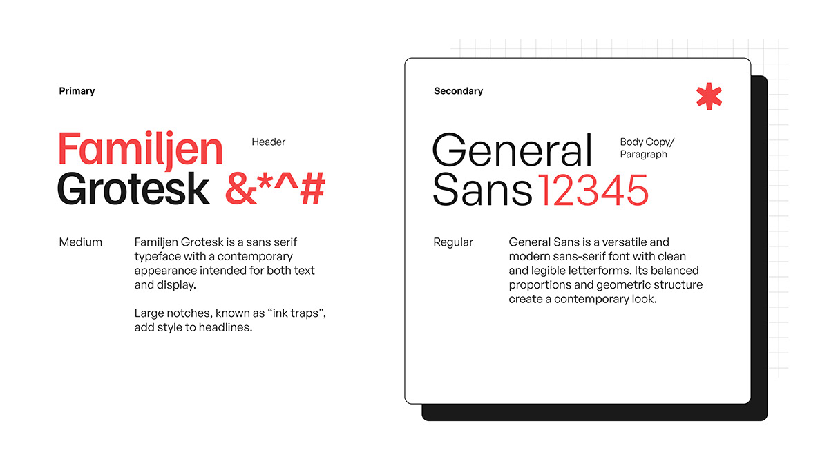
Typography
The brand employs two fonts. For the header text, Familjen Grotesk is used, which conveys a bold and straightforward aesthetic, giving a sense of reliability and modernity. As for the body text, the brand relies on the General Sans font.
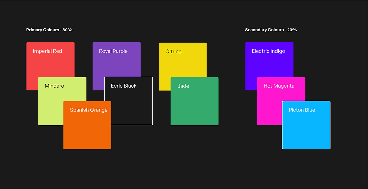
Choice of Colour:
By using vibrant, fun and Gen Z colors, rewrd can create a visually appealing and engaging brand identity that attracts the attention and interest of its target audience. These colors can communicate the brand's energetic, rewarding and youthful nature, aligning with the core values and experiences that rewrd aims to provide to its users.
Graphic Elements:
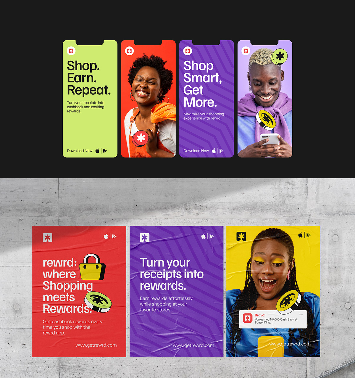
We developed simplistic perspective illustrations as a means to reinforce rewrd's brand visual language.
These visual assets serve as powerful tools in expressing various facets of the brand, effectively contributing to the overarching narrative. They possess the ability to evoke emotions and foster a profound connection with Rewrd's target audience.
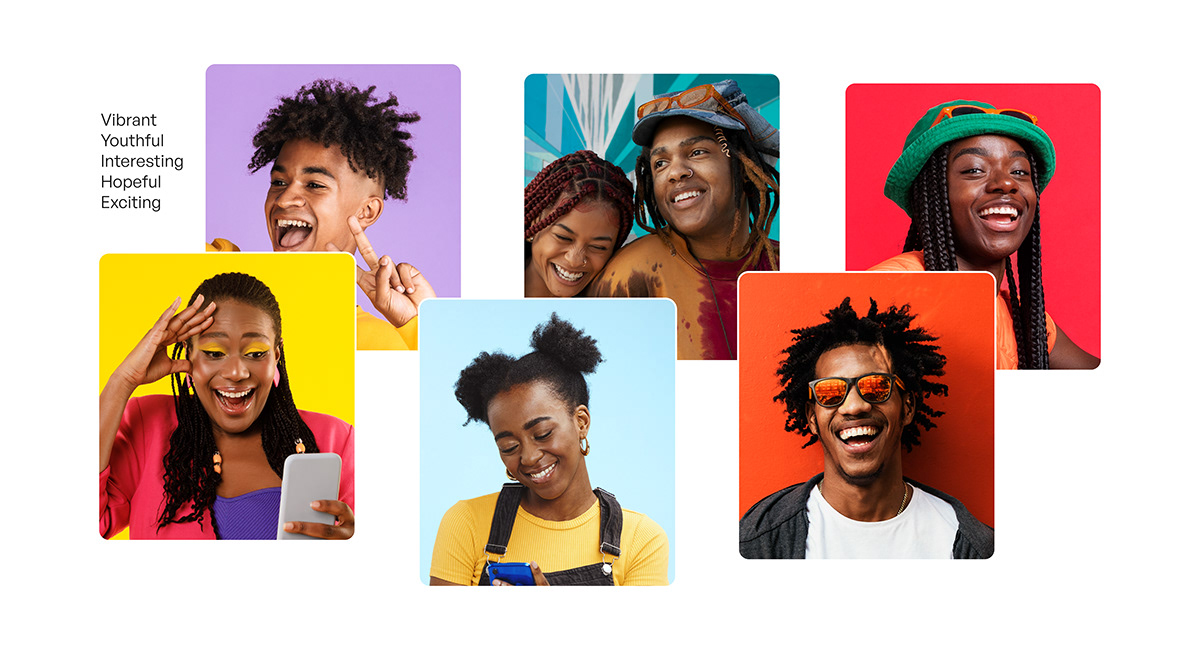
Photography:
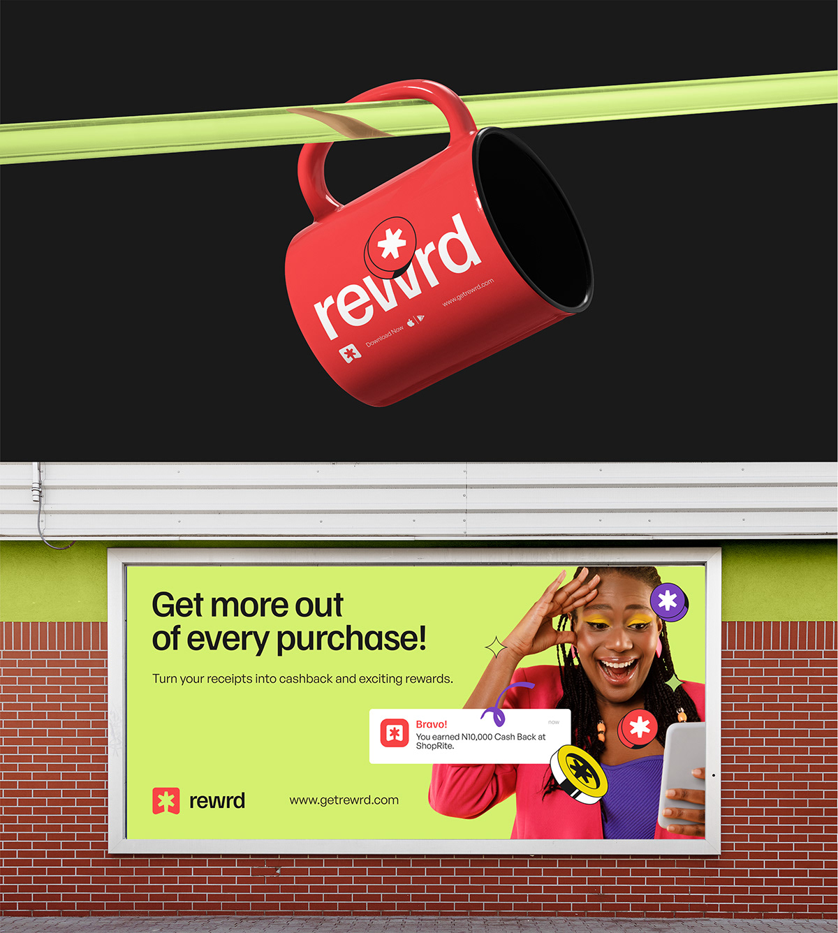
The brand utilizes colorful and youthful images for its communications to capture the attention and interest of its target audience. By incorporating vibrant and lively visuals, the brand aims to create a dynamic and energetic image that resonates with younger demographics. These colorful youth images help evoke a sense of excitement, playfulness and positivity, aligning with the brand's desired identity and attracting the attention of its intended market.
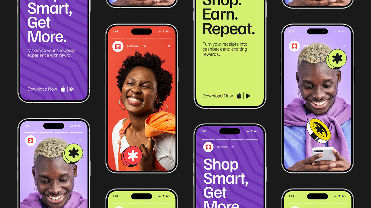
Brand Expressions:
Through successful brand implementation, Rewrd aims to create a compelling brand experience that resonates with its target audience, builds trust and loyalty and positions the company as a leader in its industry.


Thank you!
Need us to work together on a project?
Do not hesitate to shoot an email to danfopentifier@gmail.com
Do not hesitate to shoot an email to danfopentifier@gmail.com
Dribble: Pentifier
Instagram: Pentifier
Twitter: Pentifier1
Instagram: Pentifier
Twitter: Pentifier1
Recognitions


